Carteret Community College Title III Grant

January 19, 2010

Numbers Talk…No. 5: Class size, GPA and persistence – Is there a relationship?

Filed under: Cindy Schersching's white papers — cynthea1 @ 8:17 am

Click here to download a PDF of this report

It is commonly believed that smaller class sizes are positively related to stronger student performance.  While it is not clear what the optimal class size should be or if it varies by the nature of the course material, intuitively, there are several reasons that argue for the general truth of that statement, e.g.,

  • Each student gets more attention from the instructor.
  • The pace of the class can more easily be moderated to accommodate fewer students.
  • In a more intimate environment, students are likely to be less intimidated and more likely to ask questions/share perspectives.

We looked for evidence from our data to support – or not – this relationship.  Information from seven programs of study averaged across available data from Fall 2005 through Summer 2009 was reviewed.   Though they were not randomly selected, these programs do represent a diversified set of courses.

Across programs, no one program had more than 36 students in any one course.    For this analysis, the distribution of students was arbitrarily trisected such that segments with up to 12 students are compared to segments of 13 to 24 and 25 to 36 students, as appropriate (i.e., not all programs had 36 students).

Additionally, independent study courses were deleted from the analyses.   Independent study courses by definition have a very small number of students with individualized study plans which may bias the more general look at the effect of class size.

Four metrics were calculated for each class size segment within each program:

  • Average GPA,
  • The percentage withdrawing (student or instructor initiated),
  • Percentage success (the proportion of students who received a grade of A, B or C),
  • Persistence rate (proportion of students who completed the course regardless of grade).

The number of courses in each class size segment is also noted.  All details appear in the tables at the end of this analysis.

The specific hypotheses we are testing with this analysis are these:

  • Across programs, smaller classes (those with 12 and fewer students) are associated with higher average GPAs than classes with more than 12 students.
  • Across programs, smaller classes (those with 12 and fewer students) are also associated with higher success rates and higher rates of persistence than classes with more than 12 students.
  • Across programs, smaller classes (those with 12 and fewer students) are associated with lower rates of withdrawal than classes with more than 12 students.

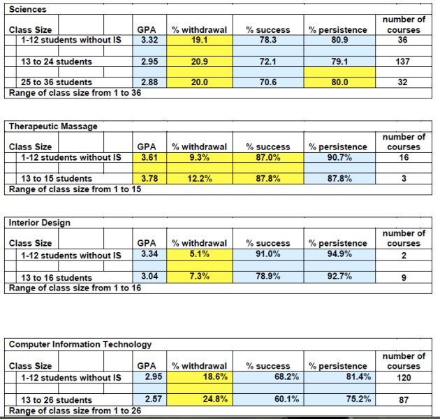
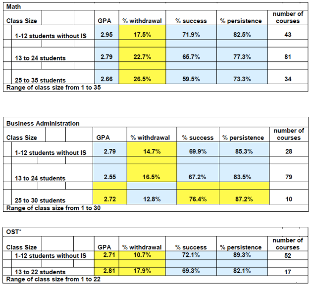
The following tables are color coded so that the outcomes are apparent.   The blue shading indicates values decline as class size increases.   The yellow shading indicates values increase as class size increases.  (Note:  These metrics tend to be intercorrelated.)

Across the aggregate of courses within each of the 7 programs…

  • GPAs in smaller classes were highest in 5 of the 7 programs.
  • Success rates in smaller classes were highest in 6 of the 7 programs.
  • Persistence rates in smaller classes were highest in 7 of the 7 programs.
  • Rates of withdrawal are lowest in smaller classes in 7 of the 7 programs.

This is a compelling set of evidence in support of the hypotheses.   However, not all of these relationships are perfectly linear when all of the data are reviewed.

  • For example, within the Sciences program, persistence rates decline when the smallest class size (12 students or less) is compared to the next class segment 13 to 24), but increase when the class segment of 13 to 24 is compared to the largest segment of 25+.
  • All of the metrics calculated for the Business Administration program also show non linear patterns.

It is not clear why the patterns deviate for these two programs.  I welcome any discussion around these anomalies; insights are often hidden within them.

Earlier blogs and discussion confirm the belief that persistence and retention are positively related, but it is unclear how strong that relationship is.  We can only suggest (as we have before) that increases in persistence will lead to increases in retention.

In this data set, the average increase in persistence when class sizes of 12 are compared to those of 13 to 24 is 3.9 pts.  While there is no guarantee that retention would increase 3.9 points with class sizes of 12 or less, a cost-benefit analysis would determine what it would cost to reduce the average class size and what increase in retention rate would justify the expenditure.

Submitted by Cindy Schersching, PhD, January 16, 2010

Key metrics by class size across select programs (Fall 2005 – Summer 2009)

Legend:  Blue shading indicates values decline as class size increases.   Yellow shading indicates values increase as class size increases.

*This definition of OST includes BUS 151, CTS 125, CTS130, CS 165 and excludes OST 080 AND 131 per the program head.

December 2, 2009

Numbers Talk…No.4: How are we doing?

Filed under: Cindy Schersching's white papers — cynthea1 @ 2:44 pm

It is frequently useful to benchmark key metrics to a known universe of similar organizations.

Benchmarking can tell us if we are moving in the right direction, how much ‘head room’ we have to grow, and, alternatively, whether there are areas that need more resource to bring performance up to par.
A second benefit of using benchmarks is that – with some assumptions – we can infer performance numbers that we are unable to generate.
For this exercise, we will use summary numbers published by Noel-Levitz, a respected agency with known expertise in educational/institutional research, and compare them to similar numbers generated for Carteret Community College (CCC). We will begin with the comparison of retention and the percent of hours completed relative to the number attempted. CCC metrics are run on the same sample definition and time frame as the benchmark numbers.

Retention Rates and Percentage of Hours Completed
Base: Cohorts, first time, full time, degree seeking

Retention Rates Percentage of Hours Completed divided by Total Hours Attempted
Noel-Levitz 2-Year Public Institutions Carteret Community College Index:
CCC/

Noel-Levitz
Noel-Levitz 2-Year Public Institutions Carteret Community College Index:
CCC/

Noel-Levitz

2007-2008 55.8% 59.3% 106 75.0% 77.6% 103

CCC compares quite favorably with these key national numbers; we are in the top half of the sample distribution of 2-year public institutions.

Noel-Levitz also generates a persistence rate for 2-year public institutions. For this time period and sample definition, it is 71.3%. For a variety of reasons, we are unable to get a comparable number for CCC.

The response to the last blog regarding persistence and retention rates suggests the relationship between these two metrics is likely a strong – though not perfect – positive one. Noel-Levitz also concludes that ’ term-to-term persistence benchmarks within a given academic year are natural predictors of year-to-year retention rates for a cohort of students. As such, these benchmarks serve as early indicators of attrition, facilitating intervention’ (2009 Noel-Levitz, Inc. • Benchmark Research Study Conducted Fall 2008—Mid-Year Retention Indicators Report).

Using these assumptions, a conservative reasonable estimate of persistence suggests CCC is also in the top half of the distribution.

When 2008-2009 estimates of these same metrics become available, we will be able to re-apply/re-test our assumptions and update these comparisons.

Submitted by Cindy Schersching, PhD, December 2, 2009

August 20, 2009

Numbers Talk…No. 3: Retention and Persistence – Is there a connection?

Filed under: Cindy Schersching's white papers — cynthea1 @ 3:37 pm

Retention rates are the proportion of students who graduate or return to their program the following semester.  Usually, retention is calculated from Fall to Fall, but Fall to Spring  metrics can be generated.   Retention is a key metric used to compare college performance throughout the US.

Persistence refers to the proportion of students who complete a course.

Typically, retention rates are reported for programs; persistence is reported for courses.

While it makes intuitive sense that persistence would be related to retention, this is challenging to prove.

Therefore, in the true spirit of blogging, I’d like to entertain all ideas regarding the hypothesis that these measures are related.

  • If you don’t think they are related, let me hear why.
  • If you think retention and persistence are related, let me know that and how strong you think the relationship is (i.e., if you know one measure, you know the other; persistence explains only part of retention-other factors are more important, etc.)
  • And if you think there is a relationship, how can we show it?

Why would a connection between retention and persistence be useful to demonstrate?

When we know which relationships have the most influence on retention, we are more likely to influence it and therefore, improve retention rates.  Conceptually, persistence is similar to retention in that the student completes something.

Further, persistence may be easier to influence than retention since it is measured at the course level.

Both are important metrics.   If retention and persistence are positively related (i.e., as one improves, so does the other), efforts to influence one metric will positively impact the other.  This will enhance our understanding of both program and course level performance using the tools already in place and give us confidence that we are using our resources in the best way.

Submitted by Cindy Schersching, PhD, August 20, 2009

August 17, 2009

Numbers Talk…No. 2: Finding meaning

Filed under: Cindy Schersching's white papers — cynthea1 @ 7:57 pm

Download a pdf of this white paper by CLICKING HERE.

A key challenge to understanding the metrics of retention, persistence and success (as well as other metrics) associated with a specific course, a program, and/or segment of the student population is to find meaning in the numbers.  Commonly, meaning is found by comparing observed metrics with a standard or benchmark.   The challenge is to determine which comparisons yield the most valuable and instructive information.

Benchmarks can be sourced in a variety of ways.    Let’s review appropriate possible benchmarks in the context of retention and educational institutions.

1.   A benchmark can reflect internal institutional standards. For example, some institutions may refuse to accept retention rates less than 80%; others may find 60% acceptable.  These benchmarks reflect the organizations’ heritage, judgment of key decision makers, financial determinants, etc.

2.  A benchmark may be the best performing institution in the ‘universe’ of all U.S. 2-year public colleges. If, for example, a two-year public college with characteristics similar to Carteret had a retention rate of 85%, we may want to base our progress against this metric.

3.  By definition, an expectation is an average.   Therefore, another benchmark can be an average across years for a specific program. A comparison of each individual year to this average across years will indicate how consistent the retention rate has been.  The challenge is to ‘beat the average.’

If a review of each individual year relative to the average highlights a significantly positive year, additional analyses will uncover the combination of characteristics that differentiates that year from the years that were at-to-below average.

The downside to this type of benchmark is that it is narrow and self-defined.

4.  Another benchmark can be created by averaging across all of the programs with the same base of students (first time, full and part time, degree seeking cohorts) within a year.  This benchmark can indicate whether or not the specific program is different from other programs taken by similar students.   If the program is a stand-out, efforts should primarily focus on analyses of institutional characteristics to identify what is contributing to this program’s success.

Of benchmarks, this approach is quite informative.

5.   An even better standard of comparison is one based on the entire college ‘universe.’ Retention rates based on the diversity of the student population most clearly highlight outstanding programs/majors as well as those underperforming.  These ‘deviations’ from the average based on the total student ‘universe’ can guide further investigations.   Learning what contributes to outstanding retention rates in one program can be leveraged across other programs to raise overall performance.

This benchmark provides very useful direction.   Comparing the same program but across different sample definitions suggests there are student characteristics – either separately or interacting with institutional factors – that are contributing to the observed retention levels.

For the Title III investigation of retention, we are using options 3, 4 and 5 (where we have data) to identify what programs are performing to expectation and to highlight those who are more successful in keeping students.

When using any benchmarks, keep these considerations in mind:

  • Learning is strengthened when comparisons to different benchmarks suggest the same outcome.
  • Meaningful benchmarks are created on robust sample sizes.  Ideally, the base for these benchmarks is 30+ students.
  • It is common to show comparisons for a specific program/major to a benchmark in terms of an index.  The index is created by dividing one percentage by another.  A rule of thumb is those indices of 80 and below and 120 and higher suggest the specific program/major is in some way ‘significantly’ different from the ‘universe’ against which it is being measured.   These indices align roughly with 2+ standard deviations (see below).

To give clarity to the idea of benchmarking, let’s take a specific example from actual data associated with the first time, full and part time, degree seeking cohorts.   We will look at the data for each of the GOT program.   Retention rates are run for fall to fall and fall to spring by years: 2005-2006, 2006-2007 and 2007-2008.  (At the time of this initial analysis fall to fall 2008-2009 data are not available.).

Retention Rates

Base:  first time, full and part time, degree seeking cohorts

Fall to Fall 2005-2006 2006-2007 2007-2008
% % %
GOT 48.2 45.1 39.3

To date, the College has not set benchmarks as defined in options one (1) and two (2).

However, we can calculate the average retention rate for the GOT program from 2005 to 2008 (benchmark option 3).

Retention Rates

Base:  first time, full and part time, degree seeking cohorts

Fall to Fall 2005-2006 2006-2007 2007-2008 Average across years
% % % %
GOT 48.2 45.1 39.3 44.2
Index to average 109 102 89
It is evident there is a good deal of consistency in the performance of students in this program.   Averaging retention rates across all programs that have this cohort base yields the following comparisons (benchmark option 4):
Retention Rates

Base:  first time, full and part time, degree seeking cohorts

Fall to Fall 2005-2006 2006-2007 2007-2008
% % %
GOT 48.2 45.1 39.3
Average across programs 53.7 48.8 52.2
Index to average by year 90 92 75
What is clear from this comparison is that compared to other programs, retention rates are somewhat below expectation from 2005 to 2007.  Retention is ‘significantly’ below average in the most recent years of 2007-2008.   Not only does this data pattern suggest that something had changed in 2007-2008, but institutional factors such as methodology, faculty (adjunct v. instructor), credit loads, etc. are likely contributing to the poor retention rates.

Lastly, we look to the universe of college students for a meaningful comparison (benchmark option 5).

Retention Rates
Fall to Fall 2005-2006 2006-2007 2007-2008
% % %
GOT 48.2 45.1 39.3
Base:  First time, full and part time, degree seeking cohorts
Average for program 31.4 34.6 25.6
Base:  All students
Index to average by year 154 130 154
The difference that appears to drive the above ‘expectation’ retention rates in this comparison suggest that cohort groups are ‘significantly’ more likely to stay in school.  We can hypothesize that the cohesiveness, peer pressure, and structure offered by cohorts are differences that make a difference.  To the extent possible, creating ‘bonded’ groups may prove particularly useful in keeping students in school.

Submitted by Cindy Schersching, PhD.  Title III

July 19, 2009

Numbers Talk

Filed under: Cindy Schersching's white papers — cynthea1 @ 10:25 pm

Download a pdf of this white paper by CLICKING HERE.

This blog serves multiple purposes:

  • It provides a forum for sharing the learning from the analyses of retention data.
  • It allows each of you time to review these analyses and pose any questions/thoughts you might have
  • It documents the work being done under the Title III grant.

The key objective of the data analyses is to provide an understanding of the factors that impact retention rates.   The retention issue is multi-faceted; data will be analyzed from a variety of perspectives.  It is expected that many of the analyses will show similar results (convergence);  when the same result is supported by a variety of analyses,  the stronger the result and more confidence we have in the learning.     Ultimately, we hope to weave a comprehensive story around the factors related to retention and design interventions that keep students in school.

At this date, retention analyses are underway amongst

  • Cohorts, first time, degree seeking, full and part time students
  • Students taking Gateway classes

The factors that may influence retention amongst these student groups (and the focus of the analyses) includes:

Gender Number of credit hours Disability Status
Age Veteran Status Declared Major
Academic Year Income level
GPA First in family to go to college

There are challenges to the analyses; every effort will be made to find acceptable solutions:

  • There are multiple data bases.  It is difficult to merge information across data bases.
  • Some information has never been collected.
  • The level of detail associated with specific variables may be missing.
  • Some information may be available on a group level only and not on an individual student level.
Retention Percentages by MajorBase:  Fall to Fall semester cohorts of first time, degree-seeking students
2005-06 to 2007-08
major return total retention rate
Boat Mfg 0 0 n/a
Biotechnology 1 1 100.0%
Radiography 8 8 100.0%
Esthetics 14 16 87.5%
Pract Nursing 6 7 85.7%
Med Asst 3 4 75.0%
BLET 20 27 74.1%
Ther Massage 14 19 73.7%
HRM 11 15 73.3%
Aquaculture 8 11 72.7%
Paralegal 12 17 70.6%
Respiratory 9 13 69.2%
ADN 7 11 63.6%
OST 4 7 57.1%
Marine Propulsion 8 14 57.1%
Criminal Justice 15 28 53.6%
Assoc. in Arts 118 225 52.4%
Horticulture 4 8 50.0%
Medical Office 1 2 50.0%
Interior Design 7 14 50.0%
Photography 14 28 50.0%
Culinary 17 34 50.0%
Cosmetology 13 27 48.1%
CIT 11 23 47.8%
AFA 8 17 47.1%
Assoc. in Science 39 86 45.3%
GOT 72 163 44.2%
Bus Adm 23 57 40.4%
EMS 5 14 35.7%
Early Childhood 13 38 34.2%
Web Tech 3 10 30.0%
Sum/Average 488 944 59.6%

Retention rates are typically displayed by major, i.e., the total number of returning students in a program is divided by the total number of students enrolled in that program.

This is an alternative way of displaying the same data.  Instead of calculating retention based on the number enrolled in a major, the percentages are based on sum of those returning and the sum of the total number enrolled across major.

There are two advantages to reviewing the data in this format:

  • It provides a real perspective on the data in the context of the total student body
  • It allows the creation of an index by major.  The index of 100 is expected if, in this case, retention rates observed by major are much greater – or much less – than expected.

The power point presentation that follows this section goes into greater detail on the value of the index.

Retention Percentages by MajorBase:  Fall to Fall semester cohorts of first time, degree-seeking students
2005-06 to 2007-08
major return total Index: Retention/Total
Boat Mfg 0 0.0% 0 0.0%
Biotechnology 1 0.2% 1 0.1% 195
Radiography 8 1.6% 8 0.8% 195
Esthetics 14 2.9% 16 1.7% 171
Pract Nursing 6 1.2% 7 0.7% 167
Med Asst 3 0.6% 4 0.4% 146
BLET 20 4.1% 27 2.8% 145
Ther Massage 14 2.9% 19 2.0% 144
HRM 11 2.2% 15 1.6% 143
Aquaculture 8 1.6% 11 1.1% 142
Paralegal 12 2.4% 17 1.8% 138
Respiratory 9 1.8% 13 1.4% 135
ADN 7 1.4% 11 1.1% 124
OST 4 0.8% 7 0.7% 112
Marine Propulsion 8 1.6% 14 1.5% 112
Criminal Justice 15 3.1% 28 2.9% 105
Assoc. in Arts 118 24.0% 225 23.5% 102
Interior Design 7 1.4% 14 1.5% 98
Photography 14 2.9% 28 2.9% 98
Culinary 17 3.5% 34 3.5% 98
Horticulture 4 0.8% 8 0.8% 98
Medical Office 1 0.2% 2 0.2% 98
Cosmetology 13 2.6% 27 2.8% 94
CIT 11 2.2% 23 2.4% 93
AFA 8 1.6% 17 1.8% 92
Assoc. in Science 39 7.9% 86 9.0% 89
GOT 72 14.7% 163 17.0% 86
Bus Adm 23 4.7% 57 5.9% 79
EMS 5 1.0% 14 1.5% 70
Early Childhood 13 2.6% 38 4.0% 67
Web Tech 3 0.6% 10 1.0% 59
Sum/Average 488 59.6% 944 3.2%

Posted by Cindy Schersching, PhD  July 19, 2009

Create a free website or blog at WordPress.com.